Introducing the BluePrint-Q Customizer
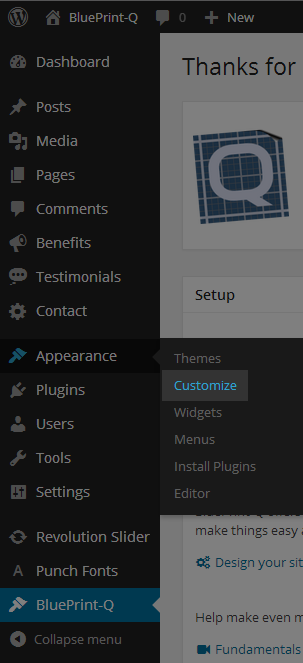
From the Admin Panel, make your way to the BluePrint-Q Customizer by clicking Appearance >> Customize.
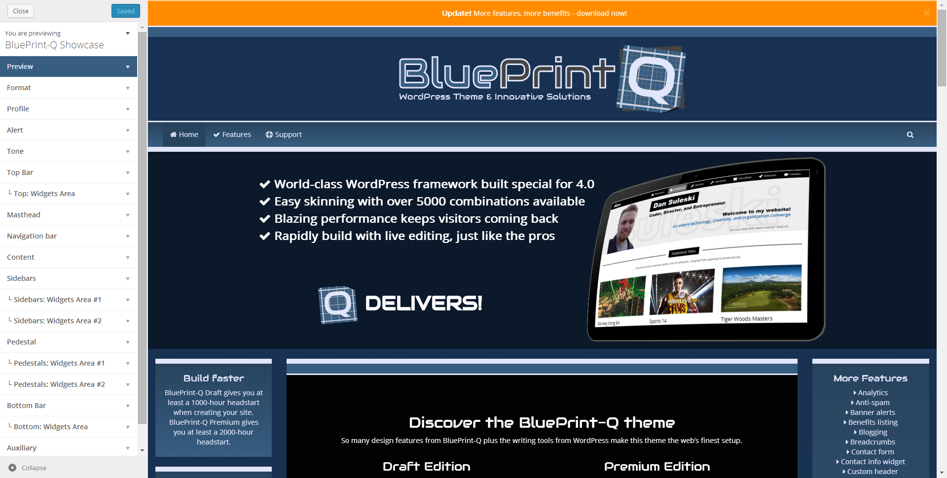
This is the Customizer. On the left are a series of sections that expand when you click on them. Each section has a number of controls that we will cover. On the right is a preview of your site’s front page. When you make a change to any of the controls on the left, you will see the change take affect in the preview on the right. Here is what BluePrint-Q looks like in the Customizer.
Sections
The best way to learn about the Customizer is to just go in and play around with it. Every change you make is visual. But for reference, here is what BluePrint-Q offers as base functionality in the Customizer.
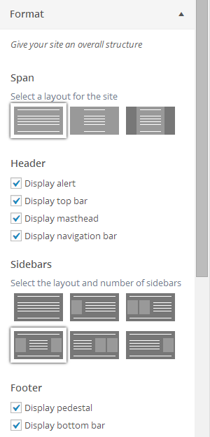
Format
- Span: Most notable on desktop screens. You can choose to have the background and content either bleed out to the edges or stay contained in the center with vertical gutters.
- Header: Choose the pieces that you want to appear on your site. You might decide to add a top bar with your contact info. Or maybe you want a one-page site without navigation. The choice is yours.
- Sidebars: Determine how many sidebars and where they will be placed relative to the main content.
- Footer: Made up of two pieces – a pedestal, which can contain a number of side-by-side widgets, and a bottom bar, which could hold copyright information, for example.
As you turn on some of these pieces, new sections will appear corresponding to what you have turned on.
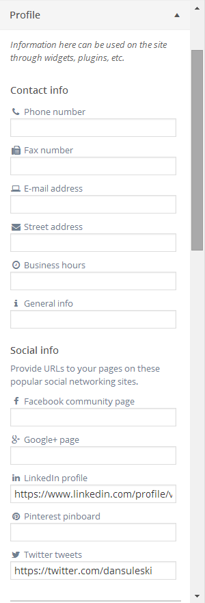
Profile
- Contact Info: Fill in your company’s or your personal contact information here.
- Social Info: Provide any pages you might run on popular social sites like Facebook, Twitter, etc.
- Extra: If you do not see the contact or social info that you want, you can extend it to what you like.
The data that you supply here can be used by the Profile widgets.
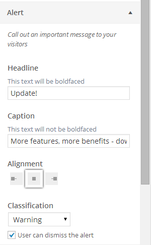
Alert
Inform visitors with a prominent display.
- Headline: Displayed first and in boldface.
- Caption: Displayed second and in regular weight font.
- Classification: Determines the color of the alert.
- Dismiss: If checked, an X will be added to the alert letting the visitor close it (like a window).
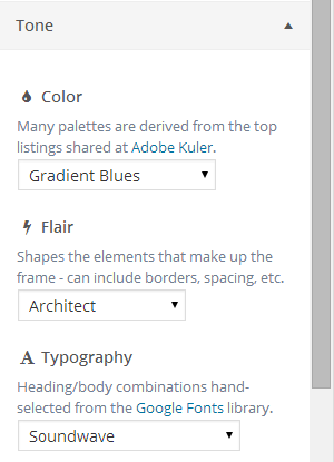
Tone
This is the magic. Mix and match from a selection of color, flair, and typography tones to create a site that is uniquely yours. Here’s what each dropdown supplies:
- Color: Choose a color palette inspired by the top picks at Adobe Kuler.
- Flair: Give your site some spark by changing shadows, borders, spacing, etc.
- Type: Pick from some professionally-chosen typography pairings supplied by Google Fonts.
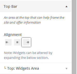
Top Bar
Optionally give your site a horizontal space at the top of the site. You can place a widget in here – just expand the “Widgets Area” section underneath.
Masthead
Especially useful for branding sites, you might choose to include a masthead – typically with a logo. By default, this masthead appears above the navigation bar.
- Purpose: You can either use text or, as is often the case, a logo. It is suggested that the logo be wide to make a good impact. Do not worry about mobile devices – the logo will be responsive.
- Layout: If you choose to split the masthead, you will push the logo (or text) to the left and add an extra area where you can place widgets to the right. For some sites, the masthead might not look good on smaller devices, so you also have the option to hide it when appropriate.
Navigation bar
You can go crazy with the navigation bar – so many options are available. You might want to use it to navigate to anchors within a one-page layout? Or maybe you want to support a login for visitors? Or you might even want to keep it blank and just use it as a beautiful graphic element? Whatever you decide, this is one navigation bar you will not find anywhere else.
- Menu: Select a menu that you have previously defined through the Admin Panel Menus screen.
- Brand: Will appear to the far-left within the bar. Set to ‘text’ and leave the textbox empty to omit. Can also set to a logo – and if you do that, you can also make it extend vertically above and below the navbar for a really cool visual effect. Just like the masthead, it might not make sense to show this element on smaller devices – there is an option to hide it in such cases too.
- Additional buttons: Display icons for logging in, searching, and shopping. The cart works with WooCommerce.
- Scheme: Bootstrap comes with a light and dark scheme on the navigation bar. If you choose neither, the BluePrint-Q tones that you have selected will kick in.
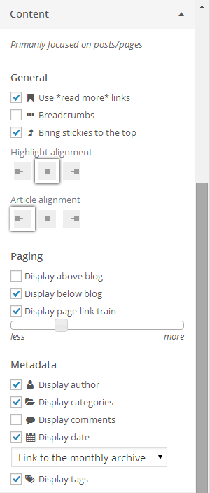
Content
Generally handles options related to the embedded WordPress page and post listings. Here is what you can alter:
- General: Include links at the ends of excerpts that point to the full articles. If a post is marked as ‘sticky’, you can force it to bubble to the top of the archives and optionally offer a navigation utility that displays the filing hierarchy associated with a page or post.
- Paging: Choose where and how the paging navigation controls are displayed. A ‘page-link train’ is a series of page numbers that offer a visitor the ability to skip to specific pages. You also have the option of shortening or lengthening how many of the jump pages are displayed.
- Metadata: Select exactly which kind of data you wish to display at the end of every article.
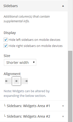
Sidebars
- Display: Sidebars are typically stacked over and under the main content on smaller devices. Sometimes, that just does not make sense. In those cases, you have the option of turning off the sidebars on mobile devices.
- Size: Choose how much width the sidebars take up.
Based on the corresponding setting in the Format section, you will see an equal number of ‘Widgets Areas’ sections where you can select exactly what you wish to display in each sidebar.
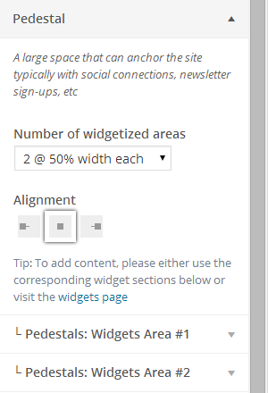
Pedestal
The pedestal is the term we use to describe the usual large area in the footer. It can contain a number of widgets that sit side-by-side. We recommend going with no more than three widgets, but options for four and six are available in the event you have an edge case. In all cases, these widgets will appear stacked on small devices.
Bottom Bar
Optionally give your site a horizontal space at the bottom of the site. Works just like the Top section. You can place a widget in here – just expand the “Widgets Area” section underneath.
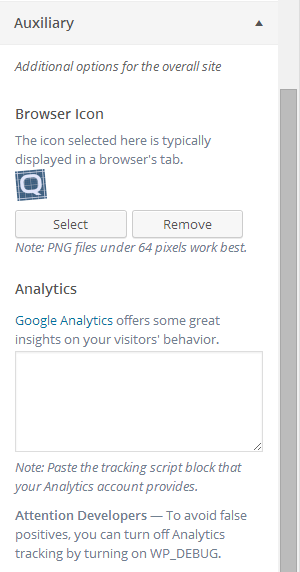
Auxiliary
Covers a number of additional options:
- To help with branding, you can give your site an icon (a.k.a. favicon). This icon typically appears in a browser’s tab, address bar, and/or titlebar. To help ensure that your icon works across all browsers, use a PNG or GIF format and keep it small at 64 pixels or less.
- Google Analytics is a telemetry solution that provides a wealth of reports. It is great at providing insights on how your visitors’ peruse your site. To use this feature, go to your Analytics account, find the tracking code, and paste it in the Customizer. BluePrint-Q will ensure that tracking code is on every page as Analytics instructs.
